As a Higher Education Institution, it is extremely important that anyone coming across your website is met with quality content, a user-friendly experience, and easy navigation. Recently, HEIs started realizing the importance of upgrading their websites regularly as part of their inbound strategy.
In today’s increasingly competitive environment, every communication channel with a prospective student or parent is absolutely vital to maintaining and growing enrollment numbers. So in order to survive the competition with other institutions, your website has to be, not just competitive, but it should set the standard for well-designed, top-performing HEIs sites.
In order to best capture and maintain the attention of prospective students and parents, it's crucial to understand what are the features that play a constant role among top-performing higher education websites.
Here are some tips to help you set up a top-performing website:

-
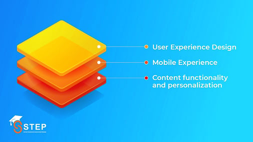
User Experience Design
Creating a better User experience or UX has been one of the main goals for every HEI in the past years as it helps gain the attention of the right audience.
When creating and maintaining your institution’s website, it is crucial to understand your users’ journeys. What did they click on after landing on the homepage? What information did they inquire about in the search bar? Asking yourself these questions and will help you provide them with content that answers their questions.
To avoid any user experience flaws, always keep your personas and user journeys in mind, conduct user experience tests, and always try to improve your website user experience.
-
Mobile Experience
The mobile experience is everything. In fact, 68% of students visit HEI's websites from their mobile devices. If your site isn’t optimized for mobile use, your institution is losing a huge amount of potential visitors and applicants. A mobile user wants advanced features and fast load times.
What does a top-performing mobile site look like? Your site should: have touch-friendly elements, de-emphasize distractions, create a visual hierarchy, allow users to quickly jump to different content, and maintain established brand guidelines, such as color and font.
In addition, the mobile site’s header should include a search bar and the institution’s logo, as well as the same menu navigation as your desktop site in order to avoid confusion.
-
Content functionality and personalization
Your website should include different content types such as images, videos, and articles. Every bit of the website content should have a strategy behind it and should seamlessly integrate with your institution's goals.
“Know your audience” Your website must creatively utilize all the information you have on your target audience and personalize their experience as much as possible. 60% of high school students are discovering colleges and universities through search engines and when they feel welcomed and their needs are being met, they’re more likely to engage, share, and keep coming back for more information.
There are many factors to consider when designing and developing an HEI website. Not only do you have to keep the standards, values, and long-term goals of your institution in mind, but you also have to consider all of the elements that make a website great.
Your website should be continuously analyzed and optimized to always align with best practices and the latest trends in order to be able to increase traffic, click-through rates, and enrollment numbers.
At Scitecs we believe in the power of a strong marketing strategy in enrollment growth that's why we created STEP -Scitecs technology in Education Program- to help HEI reach their goals by providing adequate practices and tools of the latest marketing and admission technologies.
A crucial STEP your HEI should start focusing on is improving your web strategy. If you’re looking to optimize your website to improve conversion rates and increase traffic it’s important to collect more detailed user insights. Consider evaluating your website by using our newest tool Website Grader.